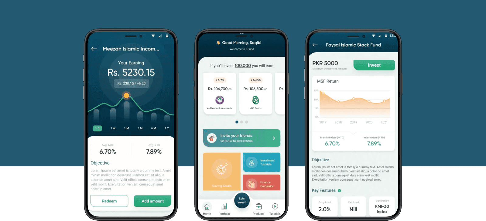
FundFinder — one app for mutual-fund investing in Pakistan
A 0→1 mobile app consolidating mutual-fund investing into a single surface — replacing a fragmented experience across multiple fund-house apps. Three months end-to-end: two on research and journey mapping, one on UI and usability testing.
- Client
- KASB Bank · via Systems Limited
- Role
- UX Researcher · UI Designer
- Year
- 2021
- Tools
- Figma · Miro · Usability Testing
Method, insight, decision, tradeoff.
The four beats that turn a project into evidence — how I researched it, what I learned, the call I made, and the compromise I accepted to make the call.
Two months of research: persona work segmenting investors by risk appetite (not age), a customer-journey map across every fund-house app they were already juggling, and one round of moderated usability testing with real investment-app users.
Investors weren't failing to invest — they were failing to keep a single view of what they'd already invested in. Switching between apps was the drop-off point.
One dashboard leading with portfolio + savings goals, in-line investor guidance instead of a separate help center, and a single account model across fund houses.
Stakeholder-approved style board before any UI work. Slower start, but the final usability rounds tested flow and comprehension — not colour or button shape.
Phases, decisions, artifacts, outcomes.
The actual shape of the work — not the marketing version. Each phase lists the calls I made, what shipped, and what moved.
Research
- Segment by investor type and risk appetite, not by age alone.
- Map pain points across every existing fund-house app users already juggled.
- Persona set (upper-tier, lower-tier, businessmen).
- Customer journey map with push/pull factors.
Reframed the product from a converter to a consolidated investing surface.
Define
- Nine features, one dashboard — no separate app per fund.
- Educational content sits inside the invest flow, not in a help center.
- Feature spec, user flows per section, IA.
Committed to a single account model with in-line investor guidance.
Design
- Style board agreed with stakeholders before any UI.
- Dashboard leads with portfolio + savings goals, not marketing.
- Wireframes, style board, final UI across sign-in, dashboard, invest, saving goals, invite, guide, calculator.
A polished, cohesive UI ready for usability rounds.
Test & Iterate
- Test with real investment-app users, not colleagues.
- Fold feedback into the same file — no separate v2.
- Usability session notes, iteration log, revised flows.
Design refined for simplicity and clarity ahead of engineering handoff.
Context
Mutual-fund investing in Pakistan lived across a handful of fund-house apps, each with its own onboarding, its own dashboard, and its own idea of what "performance" meant. Investors juggled three or four of them to keep a single view of their portfolio.
KASB Bank's brief was to consolidate that experience into a single app — one login, one dashboard, one place to explore and compare funds. The team had three months: two for research and one for UI.
Research
The persona work broke investors into three groups: upper-tier risk-takers chasing return, lower-tier risk-averse savers protecting capital, and seasoned businessmen treating investing as an operational habit. Each group used the existing apps differently and had a different definition of a good week.
The customer journey map surfaced the same failure mode across all three: switching between apps to check on a portfolio, then giving up and checking none of them.
Features
- Secure sign-in tuned for low-friction re-entry.
- Dashboard: portfolio overview, savings goals, feature entry points.
- Invest in mutual funds: explore, compare, invest across houses.
- Saving goals: set targets, track progress.
- Investor guide: in-context educational content, not a help center.
- Talk to financial experts: routed advice, not chat scripts.
- Market updates and finance calculator surfaced where they change decisions.
Decisions
The dashboard led with portfolio and savings goals — the two numbers every persona cared about — and pushed marketing content further down. Investor guidance moved out of a separate section and into the invest flow itself, so a first-time investor could learn the vocabulary while making the decision.
The style board was agreed with stakeholders before any UI work, which meant the final round of usability testing was about flow and comprehension, not colour or button shape.
Testing
Five experienced investment-app users ran through the app end-to-end. The feedback pointed at simplification — fewer taps to compare funds, clearer language around risk — and the design was revised in the same file rather than as a v2. The result: a polished, cohesive UI ready for engineering handoff at the three-month mark.