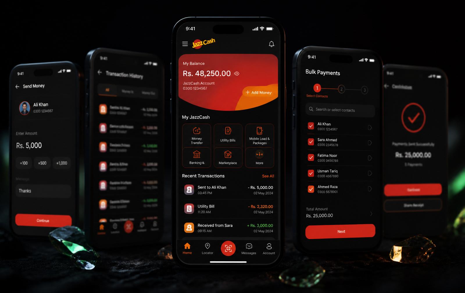
Simplifying money movement for ~9M monthly users
Pakistan's largest wallet, touched by millions the day each change shipped. The work was research, restraint, and system thinking — making it simpler to send, receive, and pay at a scale that leaves no room for error.
- Problem
- Send Money on Pakistan's largest wallet had grown to five steps, most of them confirmations nobody had pruned in years — on low-end Android, over patchy connections.
- My call
- Separated regulated confirmations from legacy ones with compliance before design started, then collapsed the rest into single input-and-confirm screens.
- Proof
- 5 → 3 steps, rolled out region by region across a wallet serving ~9M monthly active users at the time, with no cash-out incident. One of five designers on the team.
- Client
- JazzCash · IBM / Systems Limited
- Role
- User Experience Designer · 1 of 5 designers
- Year
- 2019 — 2021
- Tools
- Figma · Sketch · Adobe CC · Design System
Method, insight, decision, tradeoff.
The four beats that turn a project into evidence — how I researched it, what I learned, the call I made, and the compromise I accepted to make the call.
Live-funnel audit across the wallet and field notes from users on low-end Android with intermittent connectivity — instead of a lab study on premium devices.
Send Money's real cost wasn't the number of screens; it was legacy confirmations no one had ever pruned. Regulated confirmations were load-bearing. The rest were scar tissue.
Collapse input+confirm pairs onto single screens, keep every regulated confirmation, remove every legacy one — with compliance sign-off before design started.
A regionally phased rollout instead of a big-bang release. Slower to publicise, but no cash-out incident on a wallet serving millions of users daily.
Phases, decisions, artifacts, outcomes.
The actual shape of the work — not the marketing version. Each phase lists the calls I made, what shipped, and what moved.
Discover
- Audit every step in production, not just the flagged screens.
- Prioritize users on low-end Android with intermittent connectivity.
- Live-funnel audit across the wallet.
- Field notes from low-bandwidth sessions.
Isolated the load-bearing steps in Send Money; deprecated the rest.
Define
- Collapse input+confirm pairs onto single screens.
- Keep every regulated confirmation; remove every legacy one.
- Flow reduction spec, compliance sign-off memo.
5-step Send Money → 3, with regulatory guarantees intact.
Design
- Share the design system with the sister CRM team.
- Two-thumb ergonomics for the primary flow.
- Send Money, Bulk Payments, foundational component library.
One system carrying parallel feature work without visual drift.
Ship & Measure
- Phased rollout by region.
- 30- and 90-day post-launch reviews with product + growth.
- Rollout plan, live dashboard, follow-up briefs.
Send Money success +15% · Bulk Payments adoption +20% in three months.
Scale as a constraint
When a wallet serves millions of monthly active users, every interaction pattern is a decision made millions of times a day. Small mistakes compound into support queues, cash-out anxiety, and — for users on low-end Android with intermittent connectivity — real financial harm. The platform has since grown far beyond what it was in my tenure; the numbers I claim are the ones I worked within.
The work I led on JazzCash was less about visual redesign and more about pruning: which steps were load-bearing, which were legacy, and which were just there because someone had once added them and no one had removed them.
Send Money
The most-used flow in the app went from five steps to three, without removing any of the confirmations that regulated remittances actually require. The trick was collapsing input-and-confirm pairs onto single screens and letting the review step earn its keep as an unmistakable summary.
Post-launch, the transaction success rate rose by 15% and the drop-off between amount entry and confirmation nearly disappeared.
Bulk Payments
Small merchants had been running spreadsheets and payment lists on the side. The bulk payments feature let them import lists directly, review payees in a grid, and confirm with a single authenticated action. Adoption climbed 20% in the first three months of release.
Systems work
Alongside the flows, I contributed to a design system that JazzCash and MattressFirm CRM teams shared for foundational components. Consistency here wasn't cosmetic — it was how the platform survived a pipeline of parallel feature work without descending into visual chaos.