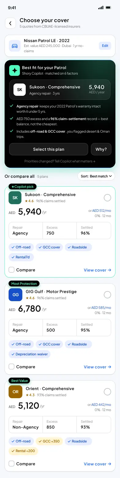
How I'd help people choose an insurance plan
A public, end-to-end UX case study built as a design assessment: reframing motor-insurance plan comparison from a table to a Recommend → Compare → Understand → Commit spine, with an explainable AI Copilot that ranks and reasons but never buys.
- Problem
- Five motor-insurance plans, near-identical prices, the same words in a different order. People stall at compare and leave.
- My call
- Open with one explained recommendation instead of a grid, then let people verify it — Recommend → Compare → Understand → Commit, with an AI Copilot that ranks and reasons but never buys.
- Proof
- 16 hours from brief to an interactive prototype. No shipped uplift claimed — the case sets out how I'd test it and what would make me kill it.
- Client
- Shory (UAE) — Design assessment · self-directed case study
- Role
- Senior Product Designer (UX + AI) · Assessment
- Year
- 2026
- Tools
- Figma · Stitch · Claude · Cursor
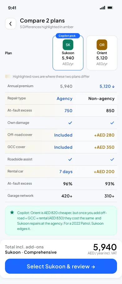
Differences-only comparison 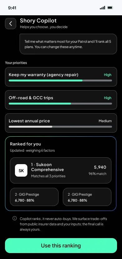
Copilot — priority sliders 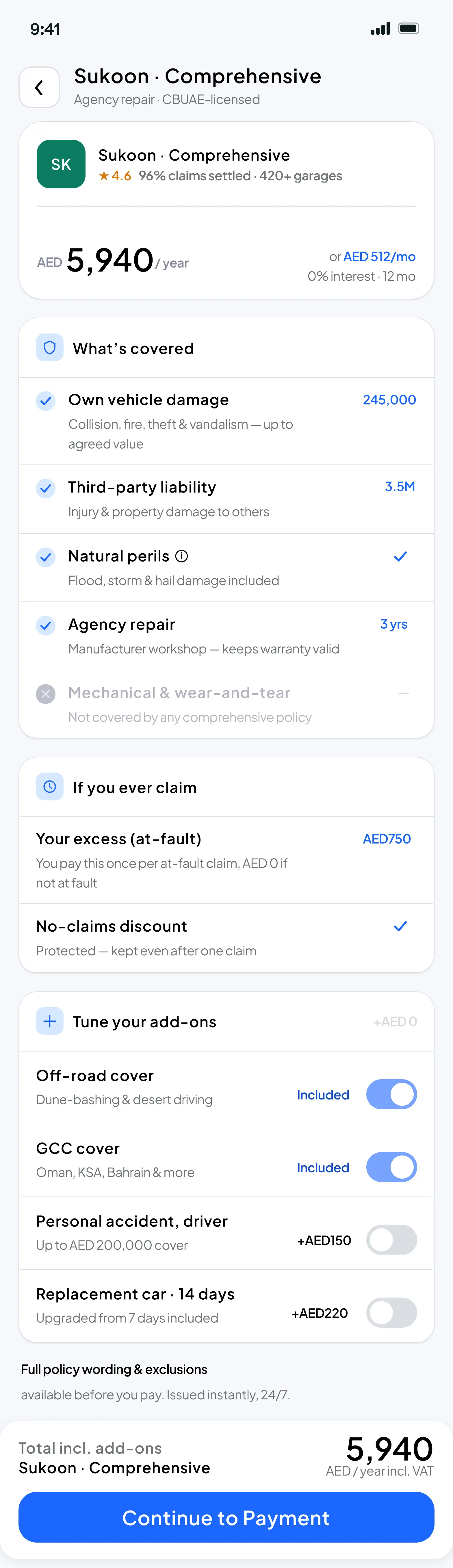
Policy detail 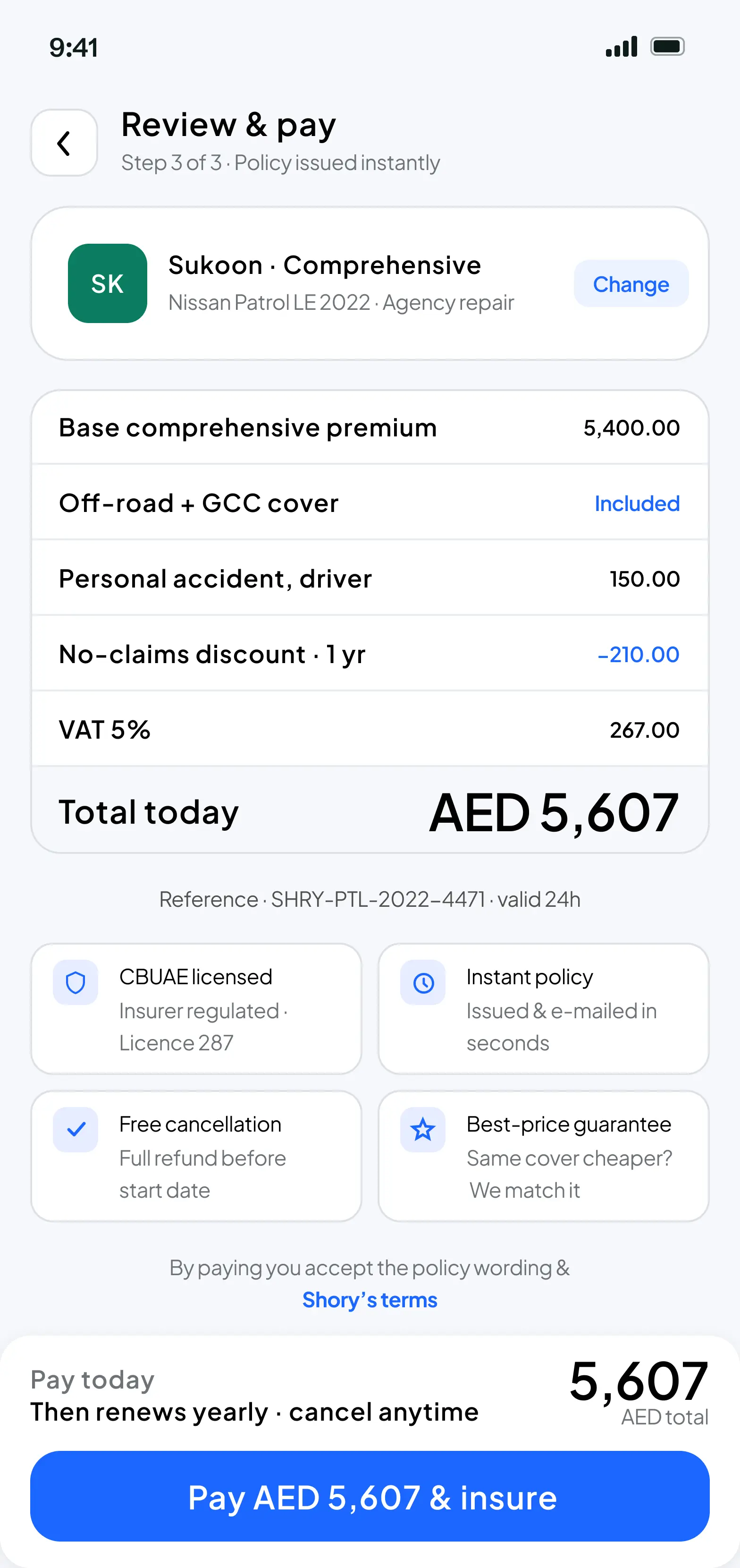
Trust signals next to Pay
Method, insight, decision, tradeoff.
The four beats that turn a project into evidence — how I researched it, what I learned, the call I made, and the compromise I accepted to make the call.
16 hours from brief to submission. Competitor teardown across Policybazaar, InsuranceMarket, and GoCompare, plus a cross-domain reference from Google Flights. Claude for research organisation and copy; Stitch + Figma for UI variations; Cursor to ship the interactive submission.
It's a choosing problem, not a finding problem. Five comprehensive plans at near-identical prices, all reading like the same words in a different order — so people stall, and leave.
Don't open with a grid. Open with one explained recommendation, then let people verify it. Everything hangs on a single spine: Recommend → Compare → Understand → Commit.
A little less control in the first few seconds in exchange for a confident starting point. I'm honest about it in the case study — and I'd test cancellations and complaints as guardrails against a false lift.
Phases, decisions, artifacts, outcomes.
The actual shape of the work — not the marketing version. Each phase lists the calls I made, what shipped, and what moved.
Frame
- Reframe from a conversion problem to a choosing problem.
- Assume quoting works; refuse to remove choice (many insurers, regulation).
- One-page problem memo.
- Assumption list, explicit constraints.
Named the failure mode: overload, invisible differences, no credible steer, fatigue.
Explore
- Steal from Google Flights: best option first, reasons visible, full list one tap below.
- AI as an assistant with an opinion it has to justify — never a black box, never auto-buy.
- Competitor teardown (Policybazaar, InsuranceMarket, GoCompare).
- Decision spine: Recommend → Compare → Understand → Commit.
One shape the rest of the flow hangs on — reusable across health and travel with different words.
Ship
- Two-column compare on mobile; three columns is unreadable.
- One honest exclusion on the plan detail — an all-green page reads like marketing.
- Trust signals sit next to Pay, where doubt spikes — not before.
- 5 mobile screens: comparison, side-by-side, Copilot, plan detail, review & pay.
- Interactive prototype with default + selected states live.
- Design tokens approximated from the public brand.
An interactive submission that reads like working software, not a slide deck.
Hold
- The metric is compare-to-purchase, not raw conversion.
- Guardrails: cancellations, complaints, gap between plan chosen and priorities set.
- Measurement plan and A/B design against the current grid.
- Task-based usability + confidence rating protocol.
A hypothesis I'd be willing to be wrong about — not an invented uplift number.
Why this is on the site
This is the one fully public case study on the site. It started as a design assessment for Shory, a UAE motor-insurance platform. I kept it published because it's the clearest artefact I have of how I actually work — from framing the problem, through the decisions I turned down, to how I'd measure it if it shipped.
It's not confidential, so it doesn't sit behind a request. Read it as the worked example that the /methodology page describes in the abstract.
The problem
The brief calls it a conversion problem. It's really a choosing problem. Finding plans is solved — the quote engine does that fine. Choosing is the hard part. Five comprehensive plans show up at near-identical prices, all reading like the same words in a different order. So people stall, and leave.
Which means more filters and bigger tables make it worse. Four things pile up: overload, invisible differences, no credible steer, and fatigue. The job isn't fewer options. It's a confident starting point.
What the market does — and what it misses
I looked at the regional players — Policybazaar.ae and InsuranceMarket.ae — then at GoCompare in the UK. They nearly all do the same thing: collect your details, then hand you a list to sort out yourself. The table is the finish line. Nobody says "for a car like yours, start here, and here's why."
The best comparison screen I know isn't insurance. It's Google Flights. It picks a best option, says why, and keeps the full list one tap below. Skyscanner and Kayak do the same. I borrowed that, and added the one thing they can skip: a plain-language reason. In insurance, trust is what sits between a recommendation and a purchase.
The decision model
Everything sits on one spine: Recommend → Compare → Understand → Commit. Recommend kills the blank state (where do I start?). Compare lets skeptics check the pick, not replace it (can I trust this?). Understand is where confidence is won or lost (what am I actually buying?). Commit is easy, if the first three did their job (am I sure?).
The tradeoff: a little less control in the first few seconds. I think it's worth it, and I'm honest about it at the end.
For each screen: the decision it makes, and the option I turned down. The rest is in the interactive prototype.
Where AI sits — in the product and in my process
In the product: the Copilot ranks and explains, but never buys for you. Every recommendation comes with a visible reason, not a black-box score. I treated it as an assistant with an opinion it has to justify.
In my process: Stitch and Figma to spin up UI variations fast, Claude to organise research and tighten copy, Cursor to build this interactive submission — prototype, case study, and live states in one deliverable. AI made me faster, not smarter. The framing, the interactions, and the calls to cut were mine.
Does it scale beyond motor?
- How do I get service? — Motor: repair type · Health: hospital network · Travel: assistance abroad.
- What do I pay on a claim? — Motor: excess · Health: deductible · Travel: excess per claim.
- What am I protected for? — Motor: coverage · Health: benefits · Travel: covered events.
- Can I trust them to pay? — Motor: claims-settled % · Health: approval rate · Travel: claims rating.
- It isn't a motor flow. It's a comparison pattern that re-skins per product. Build it once.
Impact, and how I'd measure it
I didn't run this live, so no invented uplift number. Here's how I'd prove it or kill it. The drop-off is at compare, so that's the metric: how many people get from compare to purchase.
What I'd watch: time to first selection (should fall), how many take the recommended plan vs scroll past, add-on edits as a sign people understood the plan. How I'd test: an A/B against today's grid, plus a quick task ("pick a plan for your car") with a confidence rating.
The part that matters most is the guardrails. Recommend-first can lift conversion while pushing people into the wrong plan. So I'd watch cancellations, complaints, and any gap between the plan chosen and the priorities set. The goal is correct choices, not conversion at any cost.
Honest reflection
I'm working from the outside. Shory's team knows constraints I don't, and some choices may bump into them — I'd want that conversation early. I'm unsure about the two-column compare view: right for most people on mobile, maybe frustrating for power users. I'd test a "compare more" option.
The recommendation has to be good. The whole thing rests on the first pick, so I'd spend most effort on the quality of its explanation. Next: test the three sliders with real users, check the copy with people who've filed a claim, and build the loading, empty, and error states properly.
What I enjoyed most was turning five look-alike quotes into a starting point, not another table. If I sat with Shory's team tomorrow, I'd pressure-test the recommendation copy with someone who's filed a claim, not just bought a policy.